
Creating the perfect t-shirt design involves more than just artistic talent. It requires an understanding of how to strategically use a t shirt design placement guide to place designs and logos to achieve maximum impact. Whether you’re designing for a kids’ line, a corporate event, or your own fashion label, the rules of t-shirt design and logo placement remain crucial. In this guide, we’ll delve into the essentials of t shirt design placement guide and logo positioning, helping you make informed decisions for your next project.
T-Shirt Design Placement Guide
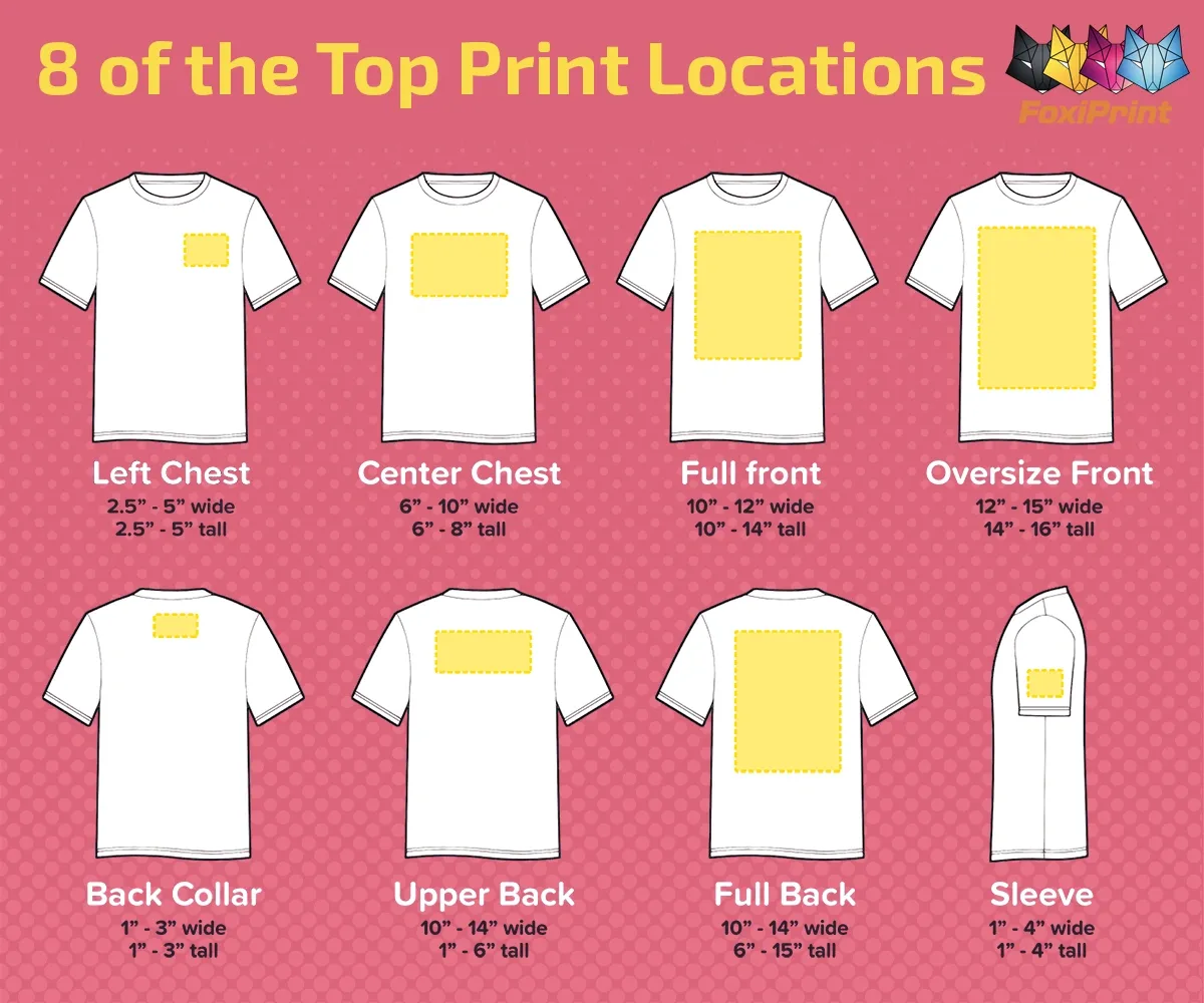
- The Standard Front Placement: Typically, this is the most common area for t-shirt designs. Positioned around the chest area, designs here are immediately visible. For an adult shirt, the design should start about 3-5 inches down from the collar.
- Centered or Off-Center: Designs can either be centered or slightly off-center (towards the heart). Off-center designs add a touch of uniqueness and are more subtle.
- The Upper Back: The area just below the neckline on the back of the shirt is ideal for additional details like taglines, website URLs, or secondary logos.
- The Yoke: A design placed right below the collar on the back of the shirt can be a trendy alternative, especially for slogans or brand names.
- Sleeve Prints: Utilizing the sleeves for a logo or a small design can add an extra flair to the t-shirt. It’s a modern twist that is becoming increasingly popular.
- The Lower Waist: Though less common, placing a small logo or symbol near the lower seam can be a unique branding opportunity, especially for high-end fashion lines.
T-Shirt design Placement Guide
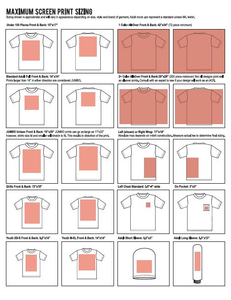
- Left Chest: This classic placement is ideal for corporate logos or small, detailed designs. On most adult shirts, the logo should be about 3.5 inches to 4 inches from the left shoulder seam and centered between the left side and the midpoint of the body. Use the t shirt design placement guide above as a reference.
- Full Front: For a bold statement, the full front is your go-to area. This placement is excellent for large graphics or text and works well on most t-shirt sizes.
- Nape of the Neck: This subtle placement can be a chic way to add branding without overwhelming the shirt’s design. It’s commonly used for brand logos on more fashionable apparel.
- Hemline Branding: Placing a small logo at the bottom hem of the t-shirt is a contemporary approach, offering a subtle branding element.
- Sleeve Cuff: Logos on the sleeve cuff are becoming more trendy, especially for sportswear or casual brands. It’s an excellent location for sponsors’ logos or small emblems.
Designing for Kids’ T-Shirts
When designing for kids’ t-shirts (Kids T-Shirts – Blankstyle), remember that the placement might need to be adjusted due to the smaller size. Designs should be proportionally smaller and positioned slightly higher to ensure visibility. This is shown in a t shirt design placement guide. It’s also essential to consider the playfulness and colorfulness of the design, making it appealing to the younger audience.
General Tips for T Shirt Design placement guide and Logo Placement
- Size Matters: Consider the size and shape of the design or logo in relation to the t-shirt size. A design that works well on an adult shirt may need to be adjusted for a child’s tee.
- Audience Appeal: Keep your target audience in mind. A design that appeals to a corporate audience will differ vastly from what works for a fashion brand or a kids’ line.
- Fabric Considerations: The material of the t-shirt can affect how a design prints. Ensure your design is compatible with the fabric (Blankstyle T-Shirts).
By following this t shirt design placement guide, you’ll be well on your way to creating visually appealing and strategically sound t-shirts. Whether you’re printing on kids’ tees or adult sizes, these guidelines will help you place your designs and logos effectively for maximum impact.