
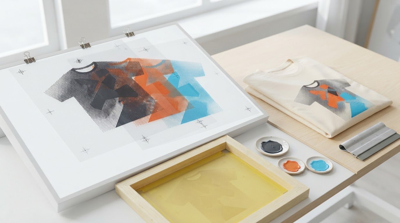
Clean color separations are just as important as the artwork itself. To understand how to prepare artwork for screen printing, set up a separate layer for each ink color, create spot-color swatches, and convert tonal artwork into halftones when needed. These steps help keep each color’s printing information clear.
A screen print uses a separate screen for each color. The challenge is preparing the file so the colors stay organized and the printed design matches your intent. This guide covers setting up layers, converting artwork to bitmap, creating spot-color swatches, and separating colors. You’ll also learn how to inspect the separations and use trapping to help prevent gaps where colors meet.
Key Takeaways
- Keep a live-text copy before outlining type, so the file remains editable while preserving the lettering’s appearance for output.
- Choose bitmap settings based on the final print size; enlarging a low-resolution image won’t restore missing detail.
- Use a garment mockup to communicate the garment color, design dimensions, and placement clearly.
- Review each separation for missing elements and intended overlaps before sending the artwork to print.
- Use vector artwork when crisp lines and shapes need to scale without losing definition.
Color separations and layer setup
Build the file around the inks: each color needs its own screen and clearly separated layer. A three-color design using cyan, magenta, and yellow shows why organized layers matter.
-
Separate Color Layers
Place each ink color on its own layer or channel, then name the layer by color, such as “Red – Pantone 186C.” Inspect each separation individually: confirm its artwork elements are present and that no unwanted colors remain. A separate screen prints each color, so combined artwork on one layer can obscure what belongs on each screen. Keep the original composite artwork available for comparison.
-
Set Up Multiple Color Layers
Arrange the color layers in a logical print sequence, then check where shapes meet. Use trapping when adjacent colors need overlap to reduce gaps caused by registration shifts. In one example, orange paths are enlarged by 1 mm to create a trap; that is an example, not a universal setting. Review the printer’s trapping requirements for the job.
For a temporary background, add a separate layer behind the design and label it clearly. Use it to preview contrast against the garment color, then hide it before preparing separations. Don’t leave a colored preview background in an ink layer unless it is meant to print.
-
Prepare Artwork for Dark Fabric
Preview the design against the actual dark garment color, then identify which areas need an underbase. An underbase is a foundation layer, often white ink, printed beneath other colors to help them show against dark fabric. Keep it on its own separation and align it with the colors above.
Check whether the underbase should extend beneath the color shapes or stay inset. A visible white edge can change the design, while insufficient coverage can let the dark garment affect the appearance of overprinted colors.
-
Check Line Widths and Gap Sizes
Inspect fine lines and narrow gaps at the intended print size. There is no single minimum width or gap size for every design: ink, mesh, garment, and printer requirements all affect which details hold. Remove isolated specks, fragile strokes, and tight gaps that may close during printing. A one-millimeter registration error can leave gaps where another color or the white garment shows through.
Common problems include missing elements in a separation, unintended overlaps, and traps that alter edges. Check each color plate, then compare the plates together before output.
- Set the design’s size and placement using a garment mockup. Show the garment style and color, the design size in inches, and its placement. This gives the printer a clear reference for how the separated artwork should sit on the finished garment.
Converting artwork to bitmap
Choose raster or vector artwork according to the design’s detail and final print size. Preparing artwork for screen printing also means converting gradients into halftones before output, so tonal changes become printable dot patterns.
- Use vector artwork for logos, lettering, and clean shapes that may need resizing. Vector paths are resolution-independent, so lines and edges stay crisp as the design scales. Keep an editable master file, then export a separate production copy in the format requested for the print job. This preserves the original paths for later edits.
- Use raster artwork for photographs, textured images, or effects built from pixels. Set the image to at least 300 DPI at the actual print size. Evaluate an image at the dimensions it will appear on the garment, not just while zoomed in on a monitor.
- Inspect the source resolution before enlarging a raster image. A 72 DPI image may print with pixelation, blurry edges, and poor-quality results. Changing its document setting to 300 DPI won’t restore detail lost from a smaller or lower-resolution source. Start with a higher-resolution original or rebuild simple artwork as vector paths.
- Check image dimensions and resolution together. DPI describes pixel density relative to output size, so enlarging artwork spreads the available pixels across more space. A file that looks sharp at a small size can show rough edges when enlarged. Preview it at final dimensions before exporting.
- Keep vector linework as paths whenever possible, and rasterize only elements that need pixel-based effects. If a design combines vector lettering with a photograph, preserve the lettering as vector artwork and check the photo’s resolution independently. This keeps the lettering crisp without compromising it to accommodate a raster element.
- Export a clean production copy and reopen it before delivery. Check that the artwork retains its intended dimensions, edges, and color separations. Compare the export with the editable master, especially around fine lettering and image boundaries. These checks are a practical part of preparing artwork for screen printing. If an edge looks soft or jagged, return to the source instead of relying on a higher DPI setting to repair it.
Text needs a similar check before you deliver the production copy. Converting text to outlines preserves its appearance when the printer does not have the same typeface installed. This keeps lettering consistent between the design file and the printer’s setup. Review outlined lettering alongside the rest of the artwork, especially where its placement or shape affects the finished design.
Keep a separate copy with live text before outlining. Once text is converted to outlines, it is no longer editable. Return to the live-text version if the wording or lettering needs revision, and use the outlined version for delivery. Keeping the versions separate prevents confusion and makes it easier to prepare a revised production copy without rebuilding the lettering.
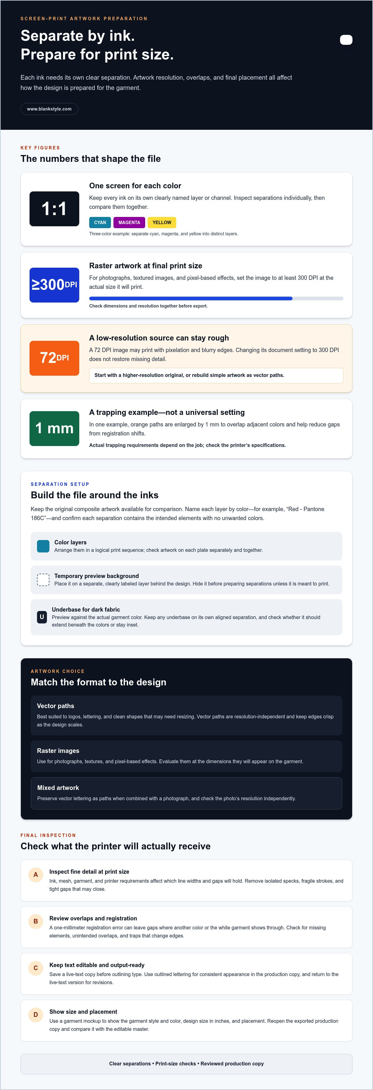
Creating spot-color swatches
Assign each ink its own spot-color swatch, then apply that swatch consistently to every matching object. Spot colors give printers control over ink matching and keep each color’s separation distinct.
- Create a dedicated swatch for each ink in the artwork. Set each swatch as a spot color, not a process color, so the file identifies it as a separate printing color. For example, define a red swatch once, then reuse it for every red shape instead of creating visually similar duplicates.
Consistent swatches keep objects together on the intended color separation. If a design uses three inks, its artwork should have three corresponding color separations.
- Name each swatch by its ink color or reference, such as “Red – Pantone 186C.” Use the same name for the matching artwork layer when practical. Clear labels help distinguish inks in the file and reduce confusion when reviewing output.
A color name alone doesn’t create a separation. Confirm that the swatch is defined as a spot color, then inspect the document’s separations preview to see whether its objects appear on the expected plate.
- Apply each swatch to the intended objects, then review the artwork one color at a time. Hide or preview other color separations to make stray objects easier to spot. For example, if a small red detail disappears when viewing the red plate, assign it to the correct swatch.
Each screen prints one color, so objects meant to print together should share the same spot-color definition. Check fills and strokes, including small details, rather than reviewing only large shapes.
- Set tint behavior deliberately when an object needs a lighter on-screen preview but a solid ink output. In one white-base example, objects display using 20% yellow but output as a solid spot color. Treat this as a specific setup example, not a universal swatch recipe.
Preview the separation itself to confirm the intended output. A pale screen preview can represent a solid spot color, so don’t rely on the canvas appearance alone.
- Inspect the separations together and individually before exporting. Confirm every intended object appears on its assigned plate, then check overlaps where two colors meet. Look for accidental gaps, duplicate objects, or unwanted colors on a plate.
Keep a composite view for visual reference and a clearly named spot-color setup for output. This makes it easier to compare the finished design with its separate ink plates.
Preparing and separating artwork by colour
Prepare each ink as a distinct separation, then inspect how the colors interact. Even a two-colour design needs careful alignment and edge checks.
- List the inks used in the final design, then map each artwork element to its intended color. For a two-colour design, create one separation for each ink and review each plate independently. Check that no object is missing, assigned to the wrong color, or accidentally duplicated. This plate-by-plate review catches errors that can disappear in the full-color composite view.
- Inspect the edges where separate colors meet, especially in small lettering and enclosed shapes. Screen printing can have inaccurate color registration, so slight shifts may expose gaps between neighboring inks. Trapping helps prevent gaps by extending one color beneath another. Choose which color extends based on the design’s edge and intended appearance.
- Apply trapping only where adjacent colors need overlap, then review the altered outline at actual print size. In one example, orange paths are enlarged by 1 mm to create trapping. That value illustrates a specific setup, not a standard for every design. Excessive overlap can change thin shapes or visibly distort borders, so inspect the affected edges.
- Separate a white underlayer from the visible color plates when the design uses white directly behind colored objects. One example offsets the white paths by -1 mm when no white outline is wanted. Treat that offset as an example, not a universal setting. Check the white plate against the color plates to confirm its edges won’t show unexpectedly.
- Use knockout where one ink should leave an opening for another color or the garment. Use overprint where colors should print on top of one another. Review both behaviors in the separations preview: a knockout removes artwork beneath it, while an overprint retains overlapping inks. Confirm the composite view still matches the intended design.
- Compare every separation with the full design before exporting. Confirm intended overlaps, clean knockouts, and visible trapping at each color boundary. Then align the plates and inspect the artwork at its final size. A one-millimetre registration error can leave gaps where another color or the white paper shows through.
Use the screen printer’s artwork requirements and trapping specifications for the final setup. Those details determine how to prepare separations for that production workflow.
What file formats and resolution are best for screen printing artwork?
Choose the file type based on the artwork: vector for scalable shapes, raster for pixel-based images. For raster files, match the resolution to the intended print size.
- Use vector artwork for logos, lettering, and clean shapes that may need resizing. Vector paths are resolution-independent, so lines and edges stay crisp as the design scales. Keep an editable master file, then export a separate production copy in the format requested for the print job. This preserves the original paths for later edits.
- Use raster artwork for photographs, textured images, or effects built from pixels. Set the image to at least 300 DPI at the actual print size. For example, evaluate a logo or image at the dimensions it will appear on the garment, not just while zoomed in on a monitor.
- Inspect the source resolution before enlarging a raster image. A 72 DPI image may print with pixelation, blurry edges, and poor-quality results. Changing its document setting to 300 DPI won’t restore detail lost from a smaller or lower-resolution source. Start with a higher-resolution original or rebuild simple artwork as vector paths.
- Check image dimensions and resolution together. DPI describes pixel density relative to output size, so enlarging artwork spreads the available pixels across more space. A file that looks sharp at a small size can show rough edges when enlarged for a larger print. Preview it at final dimensions before exporting.
- Keep vector linework as paths whenever possible, and rasterize only elements that need pixel-based effects. If a design combines vector lettering with a photograph, preserve the lettering as vector artwork and check the photo’s resolution independently. This keeps the lettering crisp without compromising it to accommodate a raster element.
- Export a clean production copy and reopen it before delivery. Check that the artwork retains its intended dimensions, edges, and color separations. Compare the export with the editable master, especially around fine lettering and image boundaries. If a shape looks soft or jagged in the exported file, return to the source instead of relying on a higher DPI setting to repair it.
Prepare a separate production copy in the printer’s requested format, while keeping an editable master. Use vector artwork for scalable shapes and raster images at 300 DPI or higher at their intended print size.
Treat resolution as a check on available image detail, not a repair control. Increasing the DPI of a design created at a smaller size does not restore lost detail. When enlarging a raster element, assess it at the intended garment dimensions and look for softness or jagged boundaries. If you see these, return to the original artwork: use a higher-resolution source or rebuild simple shapes as vector paths. Keep this decision separate from exporting, since changing the DPI label cannot replace detail in the source. For mixed artwork, preserve scalable lettering as paths and assess the pixel-based image independently before making the production copy.
Blankstyle: Wholesale Blank T-Shirts
When your artwork is ready and you need garments for a print run, Blankstyle offers wholesale blank T-shirts and Custom Screen Printing Services. Pair the garments with printing for a coordinated apparel project, moving from prepared separations to printed garments without changing your artwork workflow.
For branded apparel, Blankstyle also offers Embroidery Services and Drop Shipping Solutions. These options suit projects that need decoration beyond screen printing or a shipping workflow for finished products.
Visit www.blankstyle.com to explore wholesale apparel and printing options for your project.
Move Your Artwork Into Production
Before sending a design into production, save a clearly labeled master file and a separate output copy. Keep the original editable so future garment sizes, placement changes, or color adjustments don’t require rebuilding the artwork. A short production note can record the intended garment, print placement, and any design-specific instructions. These details help connect the approved artwork to the finished project.
Good preparation means more than making a file look right on screen. It means making deliberate choices that carry through to the printed garment. A repeatable workflow for preparing artwork for screen printing helps you revise designs with more control and hand off files in an organized way.
When you’re ready to move from artwork to apparel, Blankstyle can be part of that next step. Contact Blankstyle about your project, and take your prepared design forward with confidence.