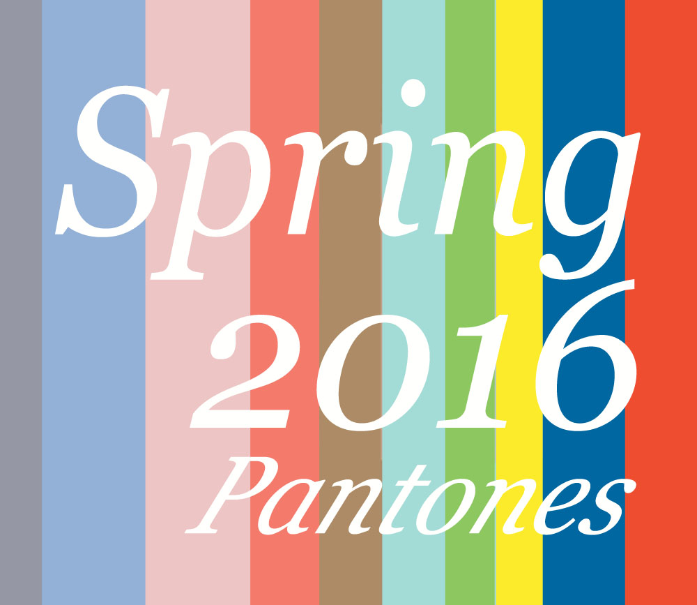
As you dive into the New Year, it’s important to keep an eye on the 2016 Color Trends when getting your orders together. Luckily we’ve done the legwork for you! We’ve rounded up the 10 most coveted pantones for Spring 2016, because making your life a little easier is kind of what we do best. Click to Shop!
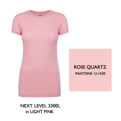
This feminine color works well for women’s basics
Rose Quartz
The palette of Spring 2016 looks to the skies and draws inspiration from the colors of the clouds. Coming out on top, Rose Quartz is a nostalgic favorite. It’s the color of sunset on those summer camping trips. It’s the color of fluffy cotton candy at the Boardwalk. And it also reminds you of your grandmother…which ends up feeling pretty cool because you love your granny, and you wish you could wrap yourself up in it. This luxe pastel holds onto the warm fuzzy feelings of Baby Pink while offering modern hints of Mauve and Taupe. The Next Level 3300L is the perfect choice!
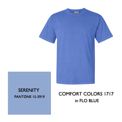
This Comfort Colors tee comes in many reined color options
Serenity
Like Rose Quartz, Serenity pays homage to the milky #skybluepink hues found in a summer sunset. This Cornflower Blue shade with Violet undertones compliments most skin tones, and sells well for men, women and kids of all ages!
This Boxy Tee is a stylish option for fashion blanks
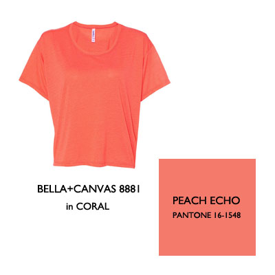
Peach Echo
As a pastel appendage to the popular shades of Coral, Peach Echo lightens things up and takes a softer approach. This springtime blush adds a sophisticated splash of color against April showers and sun-kissed skin alike. BELLA+CANVAS offers many styles in this rosey Coral shade!
This classic tee is made with 100% ringspun cotton for the softest feel
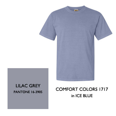
Lilac Grey
No sky-tone palette would be complete without Lilac Grey—the color of rainy mornings. This stormy hue is a neutral tone that will look great against most skin tones and will fit in well with most collections!
This Ladies Rocker Tee features a relaxed fit and raw edges
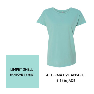
Limpet Shell
In addition to sky tones, designers are also being inspired by the colors of the river–characterized by key notes of moss, rocks and rushing water. A dustier version of Robin Egg, Limpet Shell is a creamy blue dream. This mossy tone has a vintage flair and is perfect for your collection if your customers love color but crave a sense of sophistication.
This fitted ladies tee is the perfect summer staple
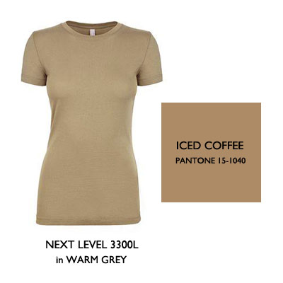
Iced Coffee
This earthy Taupe reflects the sandy banks of a riverbed. It pairs well with cool tones as well as other warm tones–particularly Peach Echo (wink, wink; nudge, nudge). It’s always nice to see a strong toasty beige make it onto the Pantone’s Top 10 Color List for 2016. Plus, who doesn’t like Iced Coffee!?
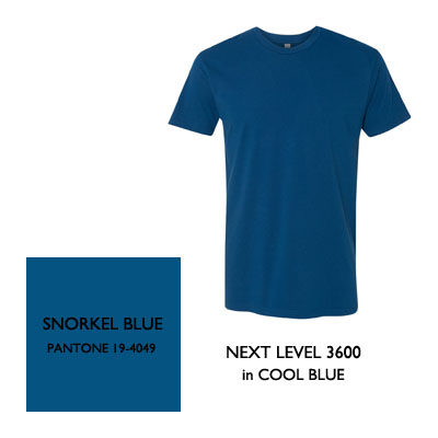
One of our best-selling tees, the 3600 is a stylish fitted t-shirt
Snorkel Blue
As deep as the Pocomoke River, this moody, inky shade has just the right amount of Navy with just the right amount of Teal. Snorkel Blue rides the wave of the Indigo trend, making it a shoo-in for sales and customer satisfaction—especially since this color looks good on everyone! Get the look with the Next Level 3600 in Cool Blue!
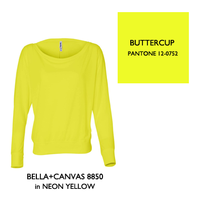
This ladies dolman sweater is also available in heather and marble colors
Buttercup
To round out the 2016 colors, we’ve got three bold and lively accent colors to spice things up. Buttercup, the most pure and true form of Yellow, instills a sense of adventure and happiness as it reminds you of the exotic vacations you always talk about planning but never actually plan.
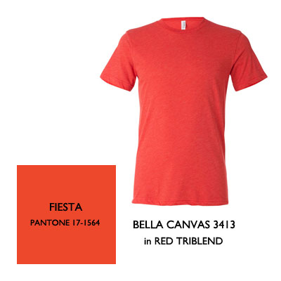
This Bella+Canvas Triblend tee is one of our best sellers
Fiesta
This rich, Orange-tinted shade makes you look like you just got back from a tropical vacation. Aside from catching the eye of everyone in the room, those who dare to rock Fiesta this summer will be showered in compliments, because this color gives the illusion of an awesome summer tan on even the pastiest of patrons. It is sure to be a hit with tank tops, dresses and tees like the BELLA+CANVAS 3413 Unisex Triblend.
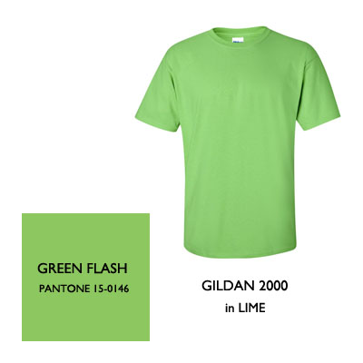
One of our most popular styles, this classic tee comes in many colors
Green Flash
Green Flash is a smooth mix between Grass and Vintage Green. With more depth than a mere Neon or Kelly shade, this color will brighten up your collection in a flash (see what I did there?) It looks great with Snorkel Blue and Limpet Shell! Try the Gildan 2000 in Lime!